
Overview
The Chat Themes module allows you to create an enterprise-wide or campaign-specific chat design.
Where to find the Chat Themes module
-
Open the Workspace.
-
Select Chat Themes under the Resources menu
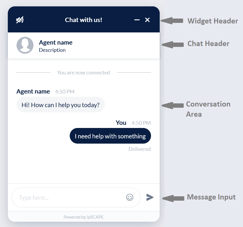
What is a Chat Theme?
A chat theme sets the look and feel for a chat session.
The sections of a chat window that can be viewed/hidden and their components individually designed are:
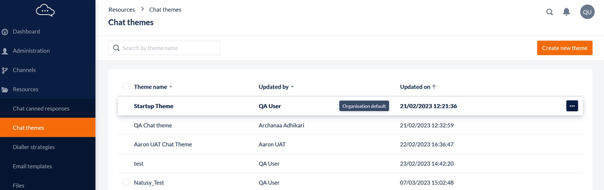
1. Display Chat Themes
This feature allows Workspace Administrators to navigate the list of chat themes.
From this list you can add, edit, delete or simply view chat themes.
-
Open the Workspace.
-
Select Chat Themes from the Resources menu.
For each file, the list displays the following details:
|
Column |
Contents |
|---|---|
|
Select/Deselect the theme.
|
|
Theme |
The Theme Name is displayed. The Organisational Default Theme will be displayed in bold |
|
Updated By |
The name (first name and last name) of the user who most recently edited the theme. |
|
Updated On |
The date and time at which the theme was most recently edited. |
|
More Options (…) |
Click to see options:
|
2. Add or Edit a Chat Theme
This feature allows Workspace Administrators to create new or update existing chat themes.
-
Open the Workspace.
-
Select Chat Themes from the Resources menu.
-
To create a new theme, click the Create new chat theme button in the header.
-
To update an existing theme or preview a theme, locate the theme name from the list and click the Options icon to select the appropriate Edit option:
-
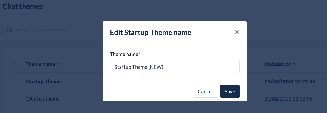
Edit a Theme Name
To edit the Theme Name:
-
Select the Edit Name from the options menu on the Theme in the list
-
Update the name in the field
-
Click Save
Edit a Theme
To edit the design of a Theme:
-
Click on the record or select the Edit Theme from the options menu on the Theme in the list
-
The user will be presented the Edit page where the appearance and messaging of the chat widget can be updated and tested
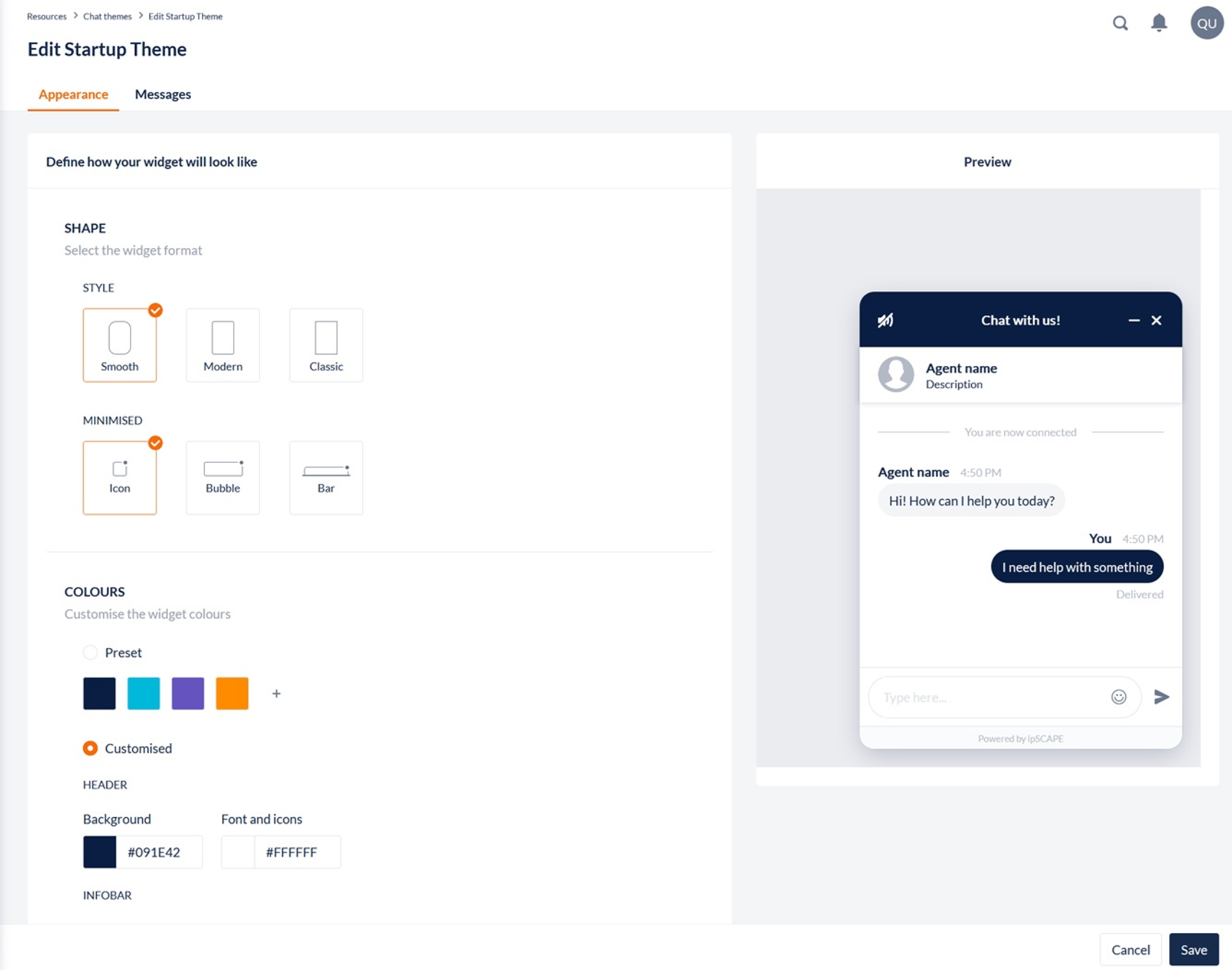
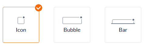
2.1. Appearance
Shape
Options are available to choose the shape and style of the widget:
Style:
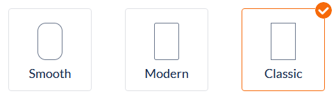
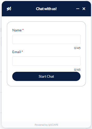
Minimised:
Colours
Options are available to customise the colours of the chat widget to match your website and/or organisation branding. The user has the option to select a Pre-set colour theme, or can created a Customised colour theme:
Pre-set:
A user can select from an already configured colour or choose to add an additional colour of their choice:
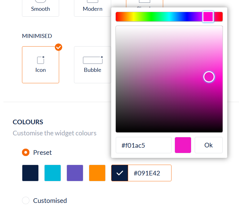
The Pre-set colours are applied to the theme like shown below:
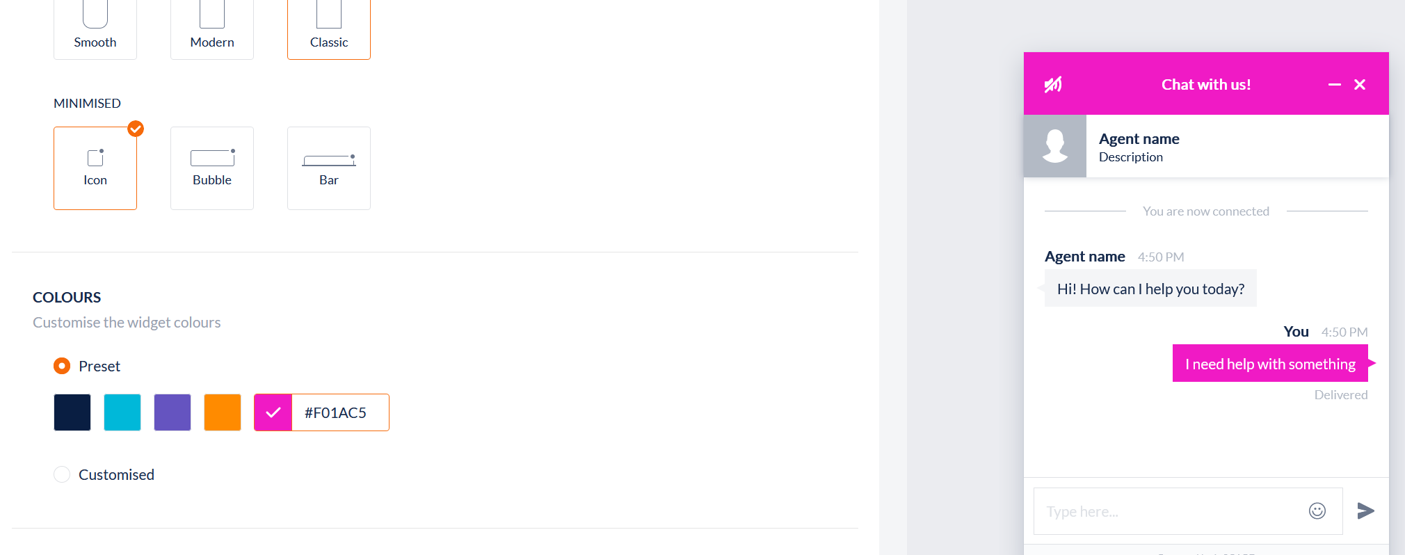
To customise the colours of different elements of the widget, see the next section for information on the Customised options.
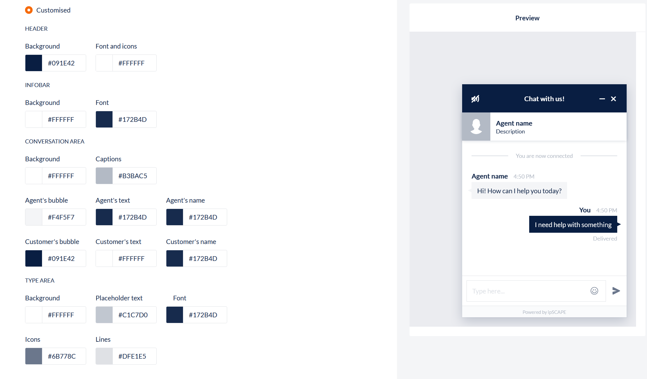
Customised
|
Section |
Field |
What you should do |
|---|---|---|
|
Header |
Background |
Use the Colour Selection Tool to set the Background Colour. |
|
Font and icons |
Use the Colour Selection Tool to set the Font Colour. |
|
|
Infobar |
Background |
Use the Colour Selection Tool to set the Background Colour. |
|
Font |
Use the Colour Selection Tool to set the Font Colour. |
|
|
Conversation area |
Background |
Use the Colour Selection Tool to set the Background Colour. |
|
Captions |
Use the Colour Selection Tool to set the Caption text Colour. |
|
|
Agent's bubble |
Use the Colour Selection Tool to set the Agent Balloon Colour |
|
|
Agent's text |
Use the Colour Selection Tool to set the Agent Message Colour. |
|
|
Agent's name |
Use the Colour Selection Tool to set the Agent Name Colour. |
|
|
Customer's bubble |
Use the Colour Selection Tool to set the Customer Bubble Colour. |
|
|
Customer's text |
Use the Colour Selection Tool to set the Customer Message Colour. |
|
|
Customer's name |
Use the Colour Selection Tool to set the Customer Name Colour. |
|
|
Type area |
Background |
Use the Colour Selection Tool to set the Background Colour. |
|
Placeholder text |
Use the Colour Selection Tool to set the Placeholder Text Colour. |
|
|
Font |
Use the Colour Selection Tool to set the Font Colour. |
|
|
Icons |
Use the Colour Selection Tool to set the Icon Colour. |
|
|
Lines |
Use the Colour Selection Tool to set the Lines Colour. |
|
|
Buttons
|
Background |
Use the Colour Selection Tool to set the Background Colour. |
Content
Here the user can define any other details to configure the widget:
|
Section |
Field |
What you should do |
|---|---|---|
|
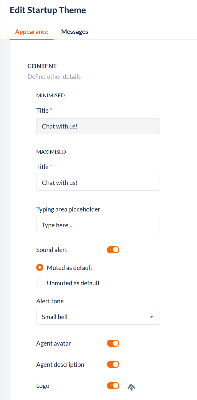
Minimised |
Title |
Enter the Title to be displayed in the Header when the widget is minimised on the Customer browser |
|
Maximised |
Title |
Enter the Title to be displayed in the Header when the widget is open/maximised on the Customer browser |
|
Typing area placeholder |
Enter the text that will be displayed to the contact in the typing area, e.g. "Type your message here and then press Enter". |
|
|
Sound alert |
Choose from Default Disabled, Default Enabled, or Disabled. When Muted as default, a sound icon appears in the window header, and a sound announces the arrival of a new message. When Unmuted as default, a blocked sound icon appears in the window header. 
The contact can enable or disable the sound alert by clicking on the icon. |
|
|
Alert tone |
Choose from Small Bell, Airplane Ding, or Bubble Pop |
|
|
Agent avatar |
Click the toggle to enable or disable. |
|
|
Agent description |
Click the toggle to enable or disable. |
|
|
Logo |
If a logo is required, click the toggle to enable to show the Select file icon. Click to open the File selector displaying image files loaded into the Workspace or the option to upload a file from the user device. To preview a image in the list, hover over the name of the file. To search for a file, click the icon in the top-right to open the search bar to search a file name. 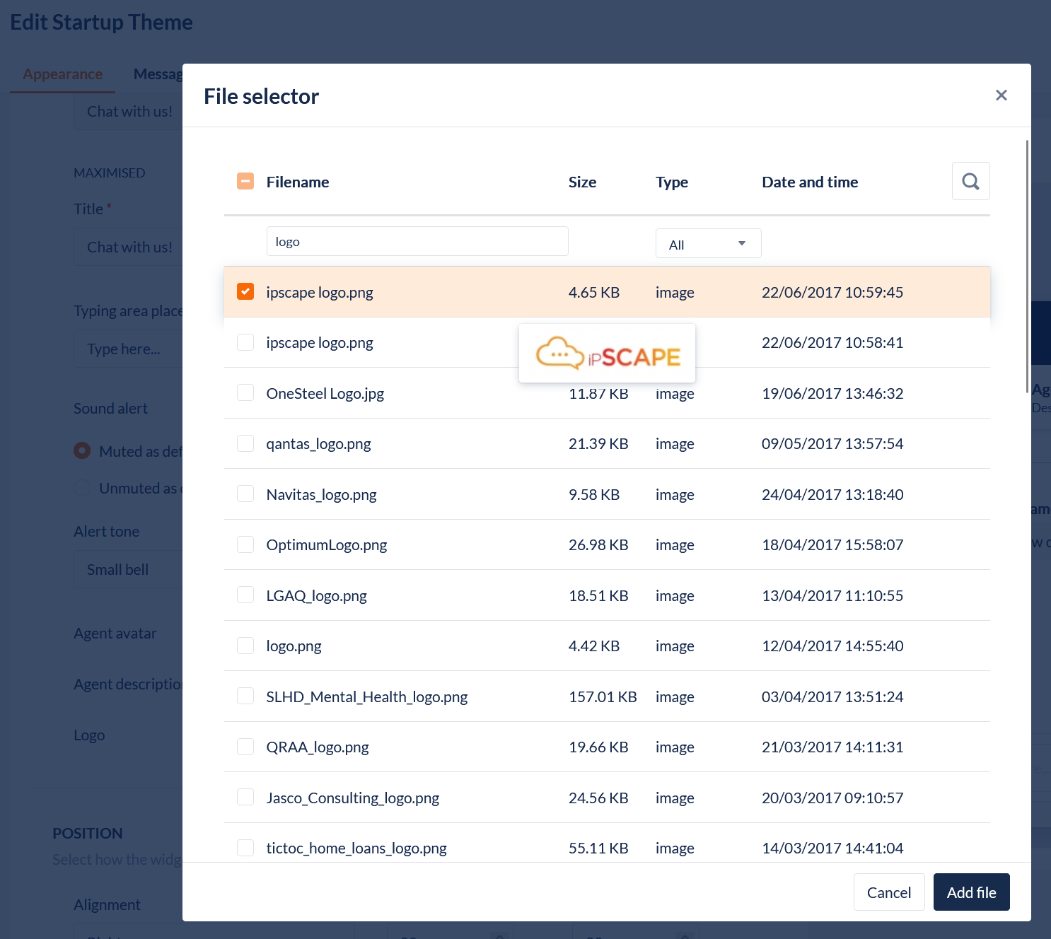
|
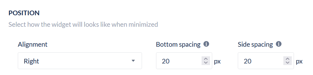
Position
The final section is defining how the widget
|
Field |
What you should do |
|---|---|
|
Alignment |
Sets the position of the widget to be displayed on the website page. Options are: Right or Left |
|
Bottom spacing |
Set the space between the bottom of the widget and the bottom edge of the browser window frame. Limited to 100px |
|
Side spacing |
Set the space between the sideof the widget and the side edge of the browser window frame. Limited to 100px |
2.2. Chat messages
|
Field name |
What you should do |
|---|---|
|
Waiting Message |
The message that appears in the info bar when the agent is not yet connected, e.g. "Please wait while we connect you to an agent." |
|
Agent Welcome message |
Enter a welcome message that a contact sees when they are connected to an agent, e.g. "Hi <system variable>, how can I help you", where the system variable used is typically the contact's name. Type “/” to add system variables |
|
After Hours |
Enter the text that a contact will see when they first request a chat session at a time that is outside of campaign operating hours, e.g. "There are no agents available to chat at this time. Please request a chat between 8:00 am and 6:00 pm." |
|
Close chat dialog |
Enter the text that a contact will see when they terminate a chat session, e.g. "Are you sure you want to end this chat conversation, <system variable>?"
|